
CryptoSite
Project Overview
The product:
Cryptosite is a website designed to enable balance transfer out of your cryptocurrency portfolio. It is a website designed responsively to suite desktop or mobile screens. A design prompt generated by Sharpen to create a balance transfer flow for a cryptocurrency site.
Project duration:
The project lasted from March 2nd 2022 to April 3rd 2022.

Project Overview
The problem:
-
Cryptocurrency sites not being secure
-
Needed a site capable of balance transfer out of your Cryptocurrency portfolio
-
Cryptocurrency sites not being accessible
-
Inconvenient user interface
The goal:
-
To design a responsive website;
-
that is secure and requires login to begin the transfer flow
-
Has a responsive layout and can be used across all devices
-
Has a convenient and direct to goal user interface
My role:
UX Designer leading the website from conception to delivery
Responsibilities:
I was responsible for the
-
User research
-
The creation of user personas,
-
User flow, Information architecture, and Site mapping
-
Wireframing,
-
Making of low fidelity prototypes
-
Making high fidelity prototypes,
-
Conducting usability studies
Understanding the user
-
User research
-
Personas
-
Problem statements
User research: Summary
The research method was via secondary research across various sites on the internet and also viewing research results on major challenges cryptocurrency users face. I chose a secondary research method because of budgets and financial constraint on this project. Insights from the research include:
-
Cryptocurrency sites not being secure
-
Cryptocurrency sites having a very difficult and Inconvenient user interface for first time users
-
Majority of cryptocurrency sites are not accessible and are very difficult to use for people with special needs.
I identified user pain points from the research results:
Inconvenient user interface
Cryptocurency sites not being accessible and having security issues
Meet the Users: User Persona
This user personas are a narrative description of my users, They help me and others to empathize with the users and understand their pain points.
Problem statement:
Sham is a cryptocurrency trader who needs to be able to make seamless cryptocurrency transactions because she wants to continue making money.
.png)
Problem statement:
Dayo is a cryptocurrency trader who needs to be able to easily transfer funds between wallets because he wants to invest in cryptocurrencies and keep on making money.
.png)
Starting the design
-
Paper wireframes
-
Digital wireframes
-
Low -fidelty prototypes
-
Usability studies
Paper Wireframes
From my research, I found out that users will need to have better user interfaces that are accessible to all users and that are not prone to insecurities. These results influenced my ideation and creation of this wireframes.


Digital Wireframes
After creating the paper wireframes, I went ahead to convert them to digital wireframes.
As I did this, I made sure that they were easy to help my user to be able to achieve their goals on an easy to use interface by creating the right information architecture for this site
As this digital wireframes were being made, I made sure the user was always in my thought process and also made revisions that would better improve user experience different from the paper wireframes
Menu bar that displays main pages of the site

The brand logo which users can use to navigate back to the home screen from any page

Selectable text that leads to another page
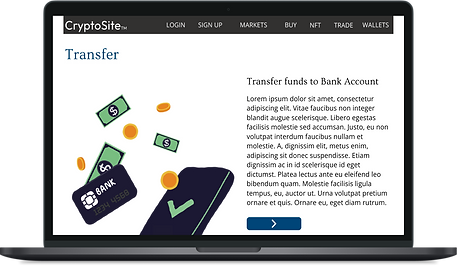
Title of transfer page
Low Fidelity Prototype
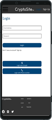
The user flow begins as the user enters the site, the user is greeted with the homepage, at the homepage the user sees the login or sign up action on the menu bar, an existing user signs In and is greeted by a welcome message and directed back to the homepage.
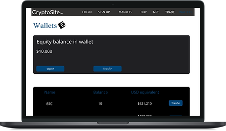
User then clicks on wallets to see their portfolio balances, selects the cryptocurrency they wish to transfer out and select whether to transfer it to another bank account or another digital wallet, upon selection of any either of the above they are guided to a screen by which they can select the amount they want to send and destination.
After doing this, they receive a clarification message asking them to confirm Their transaction, once approved they are given a congratulatory message and giving options back to the homepage or to share the receipt of their completed transaction.
_edited.jpg)
Usability Study Parameters and Findings
Study type
A moderated usability study
Participants
5 participants
Location
Nigeria, Ilorin(On-site)
Length
20 minutes
I conducted two rounds of usability study. Findings from the first study helped guide the designs from wireframes to mockups. The second study used high-fidelity prototypes and revealed what aspects of the mockup needed refining. A usability study was conducted on persons who are seasoned traders in the cryptocurrency market and a new beginner trader.
Findings from the first round showed that:
-
Users would like the symbol of the cryptocurrency at the wallet screen and will like to see the equivalent in dollars
-
Would've liked an option to choose where to transfer funds too
Findings from the second round of usability study showed:
-
would like a way to know that the transfer icons are clickable or the transfer to destination screen link to other pages
-
Would like the cryptocurrency icons added to the wallet page to add more visual cues
Refining the design
-
Mockups
-
High-fidelity prototype
-
Accessibility
Mockups
Early designs were built with the user in mind and to help achieve the user's goal, but after the usability studies, I added buttons to the transfer page to help enable the user know that this content is clickable and shows it's continuity.
I also added other cryptocurrency icons to the wallets page to give the user visual cues and to improve the overall user experience.

Before Usability Study
After Usability Study

Button that shows continuity

Before Usability Study

After Usability Study
Desktop


Mobile

_edited.jpg)
Accessibility considerations
-
Added labels and text to icons in the navigation bar to make them identifiable when the app is being used with screen readers
-
And made sure my colours were contrasting and readable and under accessibility guidelines
-
Made sure to use hierarchy in my text to differentiate headings from placeholder texts which will also increase its functionality with screen readers
-
Used icons and buttons to make navigations easier
-
Made sure to use hierarchy in my text to differentiate headings from placeholder texts which will also increase its functionality with screen readers
Going Forward
-
Takeaways
-
Next steps
Takeaways
Impact:
Cryptosite is a responsive website and can work on various devices and screens, which removes restrictions for users on what type of device they'll prefer to access the site with.
It has a clean, intuitive user interface that makes it easier for users to achieve the balance transfer flow and to help them achieve their goals of transferring wallet funds between balances. It also has security measures in place that will help users feel more secure when transferring balances
What I learned:
While designing CryptoSite, I learned that the first ideas are just the beginning of the process. I also got a chance to learn of different design systems one can use for Web design. Usability studies and peer feedback influenced each iteration of CryptoSite’s design.
Next Steps
-
Conduct another round of usability studies to validate whether the pain points users experienced have been effectively addressed
-
Conduct more user research to determine any new areas of need
Let's Connect
Thank you for your time reviewing my work on Cryptosite! If you'd like to see more or get in touch, my contact is provided down below:
Email: aolajesu@gmail.com
Phone number: +2349015976582